U-HAUL HOMEPAGE · LIVE PROJECT
Turning the homepage into an action hub
© U-Haul Homepage

ROLE
Lead Designer
TIMELINE
10 Weeks
TEAM
17-person cross-functional team
SKILLS
Content StrategyUX StrategyCross-functional LeadershipDesign Systems
PROBLEM
Reservations lacked a clear homepage overview
The U-Haul homepage is a key touchpoint for customers, but it lacked a clear overview of upcoming reservations. Users often struggled to find details like pickup time, location, or next steps, driving more support calls.

Journey Mapping
Mapped the end-to-end truck lifecycle across pickup, use, and return to identify where customers lost the most time.
Field Research
Observed customers at pickup locations during peak weekend hours to see firsthand where lines, confusion, and delays formed.
Cross-functional Collaboration
Partnered with ops and store teams to validate that proposed changes were feasible within existing rental hardware and staffing constraints.
SOLUTION
Order cards as at-a-glance action hubs
By introducing order cards on the homepage, we can provide at-a-glance visibility into active and upcoming reservations. These cards act as action hubs, surfacing key details, next steps, and quick links, reducing friction, lowering support requests, and building user confidence from the very first screen.

CORE FLOWS
Three rounds to get the visual hierarchy right
First design: grouped by date, but limited space to start the process and lacked scalability. Second design: added structure, but still missed visual impact and failed to guide attention. Final design: bold imagery and clear hierarchy made key details easy to spot, act on, and follow. Especially when juggling multiple orders from different businesses, strong visuals proved key to keeping users oriented and focused.
First Design
Grouped orders by date, but left limited space to start the process and didn't scale as customers took on more orders.
Second Design
Added more structure to each card, but the layout still lacked visual impact and didn't do enough to draw attention to what needed action.
Final Design
Bold imagery and clear hierarchy made key details easy to spot, act on, and follow, especially when customers were juggling multiple orders from different businesses.
Iteration
A flexible framework for scalable order cards
We developed a flexible framework for scalable order cards that could adapt not just in content, but in interaction type and business logic, spanning truck reservations and storage orders, each with their own set of states from quote through completion. This ensured the system could support multiple services without sacrificing clarity or adding overhead to the team.
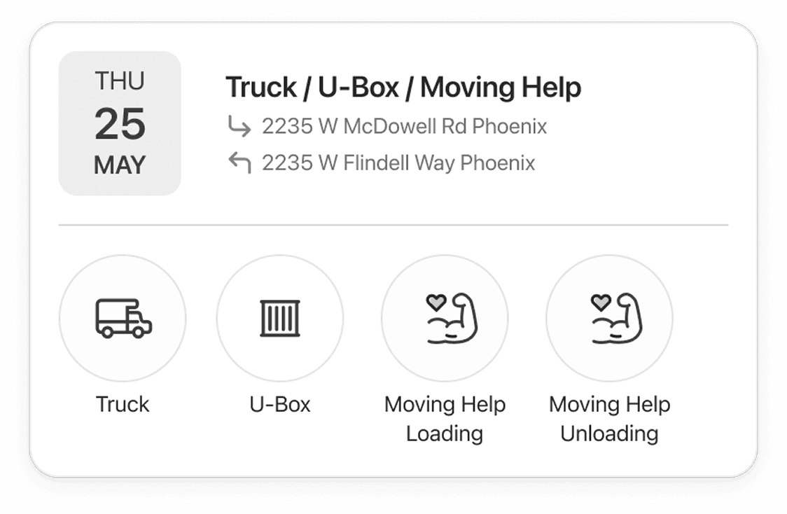
One Card, Every Service Type
The same card adapts to let users choose between a truck, a U-Box, or moving help, loading and unloading, all within one flexible layout instead of a separate screen per service.

Upcoming and Ready to Go
Before pickup, the card leads with the scheduled time and one primary action. The chevron opens full order details without cluttering the card itself.

Active and In Progress
Once a rental is underway, the card surfaces what people actually need mid-trip: find the truck's location, get roadside help, or extend the rental, without digging through a menu.

What User Testing Revealed
User testing showed people had trouble finding the card's CTAs. Since the card scales depending on the truck's stage, highlighting the status became key, giving users an immediate, consistent read on where things stand before they look for what to do next.


Strategic directions
Three Bets on How the Homepage Should Work
The directions that shaped the final order-card experience.
Tradeoff: One idea we explored was giving each order type, truck reservations, storage orders, its own dedicated card layout, since their details and next steps differ. That risked fragmenting the experience and adding maintenance overhead as more order types were added. We chose a single flexible card that adapts its content and actions based on order type and status, prioritizing consistency and scalability over highly tailored per-type layouts.
One Card, Many Order Types
One flexible card component that adapts its content, actions, and status based on order type, instead of separate layouts for each service.
Status Over Chronology
Surface what needs action now, payment due, pickup today, ID required instead of just sorting reservations by date, so time-sensitive orders don't get buried.
Depth on Demand
Keep the card itself lightweight and scannable, pushing full details to an expanded view, so the homepage stays clear even with multiple active orders.

reflections
Key Takeaways
Design in Iterations
Three rounds on the order card layout showed that structure alone wasn't enough, visual hierarchy and imagery mattered just as much as information architecture.
Build for Flexibility Early
Designing the card to flex across order types from the start saved rework later, as new order types were added to the roadmap.
Clarity at a Glance
The homepage needed to answer "what do I need to do next?" in seconds, not paragraphs, a reminder that at-a-glance clarity beats completeness on a dashboard.
Airbnb AI Planner
Talkvisor